

Typography is often an overlooked aspect of web design, but it plays a crucial role in shaping the user experience and conveying your brand's personality. The fonts you choose can greatly impact how visitors perceive your website, so it's essential to select them wisely.
In this guide, we will explore the importance of typography and provide tips on choosing the right fonts for your website.
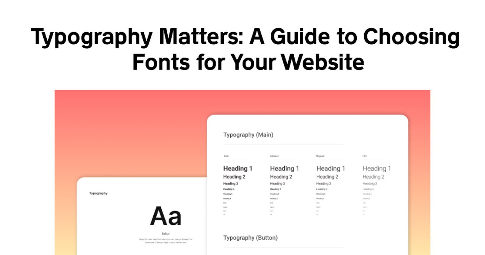
The Role of Typography in Web Design
Typography involves the selection, arrangement, and design of fonts to enhance the readability and aesthetics of your website's content. It serves several important functions:
1. Readability
The primary purpose of typography is to make your website's content easy to read. Legible fonts with appropriate spacing and line height ensure that visitors can comfortably consume your information.
2. User Experience
Typography influences how users interact with your website. The right fonts can create a pleasant browsing experience, while poor typography can lead to frustration and deter users from staying on your site.
3. Brand Identity
Typography is a powerful tool for establishing and reinforcing your brand identity. Your chosen fonts should align with your brand's values and personality, helping to convey the right message to your audience.
4. Visual Hierarchy
Good typography guides users through your content by establishing a clear visual hierarchy. It highlights important information, such as headings and key points, while maintaining a logical flow.
5. Aesthetics
Typography also contributes to the overall aesthetics of your website. The fonts you select should complement your design elements and create a cohesive look and feel, opined some top website designing companies in Bangalore.
Now that we understand the significance of typography, let's delve into some practical tips for choosing the right fonts for your website.
1. Understand Your Brand
Before you start browsing font libraries, take a step back and assess your brand. What are its core values, personality traits, and target audience? Your fonts should align with these aspects of your brand. For example, a law firm may opt for traditional and formal fonts, while a creative agency may choose more playful and modern options.
2. Limit Your Font Selection
While it may be tempting to use a variety of fonts, it's generally best to stick to a limited set. A typical combination includes one font for headings (display font) and another for body text (body font). Using too many fonts can make your website appear cluttered and unprofessional.
3. Prioritize Readability
One of the primary goals of typography is to ensure your content is easy to read. When selecting fonts, prioritize legibility. Avoid decorative or overly stylized fonts for body text, as they can be hard on the eyes. Save creative and elaborate fonts for headings or logos.
4. Consider Font Pairing
Font pairing involves selecting two or more fonts that complement each other while creating visual contrast. A popular approach is to pair a sans-serif font with a serif font. For instance, you can use a sans-serif font for headings and a serif font for body text. This combination provides a pleasing contrast and enhances readability.
5. Test for Different Devices
Fonts can appear differently on various devices and screen sizes. To ensure your typography looks consistent and readable, test your font choices on different devices, including desktops, tablets, and smartphones.
6. Pay Attention to Line Spacing
Proper line spacing, also known as line height or leading, is crucial for readability. Avoid cramped text with minimal spacing, as it can make your content feel dense and difficult to read. On the other hand, excessive line spacing can disrupt the flow of text. Aim for a balance that enhances readability and aesthetics.
7. Test Font Sizes
Font size is another critical factor in readability. Ensure that your font sizes are suitable for both desktop and mobile users. A general guideline is to use larger font sizes for headings and slightly smaller ones for body text. However, it's essential to consider your target audience and their preferences.
8. Use Web-Safe Fonts
To ensure your chosen fonts are displayed consistently across different browsers and devices, it's advisable to use web-safe fonts or web fonts hosted on services like Google Fonts or Adobe Fonts. Web-safe fonts are pre-installed on most devices and provide a reliable rendering experience.
9. Seek Inspiration
If you're struggling to find the perfect fonts for your website, take inspiration from other websites and design resources. Explore websites with similar themes or target audiences to see what fonts they use. This can provide valuable insights and help you make informed decisions.
10. Get Feedback
Lastly, don't hesitate to seek feedback from colleagues, friends, or design professionals. A fresh perspective can uncover issues or opportunities you might have missed. Collecting feedback can refine your typography choices and lead to a better overall design.
Conclusion
Typography is a critical element of web design that significantly impacts your website's readability, user experience, and brand identity. By understanding your brand, limiting your font selection, prioritizing readability, and following these practical tips, you can choose the right fonts that enhance your website's aesthetics and effectively convey your message to your audience. Typography matters, so invest the time and effort to make the best choices for your website's success.